Monday, November 20, 2006

FINALly, my FINAL project's FINAL essay!
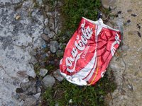
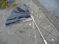
The following is the essay that I wrote explaining my final project for the Roadtrip. The photographs are from NYC, London, Amsterdam, and Berlin, respectively.

I titled my project Urban Anatomy because I felt that this title reflected the shift in focus that my project made from documenting how “garbage can be beautiful” to using it to become more intimately acquainted with the cities in which we traveled. I developed this project because I wanted to see whether garbage could tell me anything new or insightful about the nature of a city and the people in it beyond the sometimes superficial images with which I was presented, both on a citywide level (e.g. banners decrying the great nature of the city) and a personal level (such as fashion sense).

The initial inspiration for my documentation of garbage came in New York City when I noticed piles of garbage bags in and on many of the streets. The bags caught my attention because I am accustomed to seeing them in garbage cans instead of simply on the sidewalk. I wondered whether the bags of garbage bothered the people of New York, but they didn’t seem to; I watched numerous people throw their own garbage into the already heaping piles with unconcerned expressions on their faces. After acknowledging that throwing bags out of doors is simply the way that garbage is handled in New York, I became less disturbed by and more interested in the subject of urban garbage. I then decided to take as many photographs of garbage/discarded items in each of the four cities as I could and narrow them down to 50 in order to explore this subject in depth, not really knowing whether or not this would be my “final project,” but knowing that it was of interest to me.
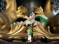
While thinking about garbage and its apparently ubiquitous presence in large, urban settings, I decided that in order to better explore the fairly broad question of “What can garbage tell me about a city and the people in it,” I should focus not on documenting garbage in general, but on individual pieces of litter, rubbish, and discarded objects. Thus, I decided to photograph primarily individual objects or take close ups of small sections of rubbish piles. As soon as I implemented this idea into my work, the quality of my photographs improved greatly, both in terms of subject and composition.

In order to further expand upon my central concern with this project, I thought of several sub-questions that helped develop the first. These questions and their subsequent answers include:

-What does the term “garbage” constitute?
I came to define “garbage” as pretty much any object that I saw on the street, because, to me, the fact that an item was on the street indicated that its primary purpose had been fulfilled, and that someone had made the conscious decision to discard it.

-Is garbage similar in different cities? Different countries?
Garbage was pretty similar across the four cities we visited. The product names of different pieces of rubbish changed, but the same types of products were discarded, such as alcohol bottles, fast food wrappers, newspapers, paper cups, and the odd article of clothing.

-What are the most discarded items?
Cigarette butts were by far the most discarded item that I found, especially in Berlin; in some areas it seemed as if practically every square inch of pavement was covered with them. This is perhaps a faulty item to declare as the “most discarded” because cigarette butts are incredibly small and prevalent compared to other forms of garbage, but they were everywhere in each of the four cities, so I think that counts for something. Second to cigarette butts were alcohol containers, including cans and bottles, some of which were very interestingly placed on bicycle seats, balancing on posts, or leaning between the bars of metal fences. I find it interesting that these two items were the most prevalent; they demonstrate that smoking and drinking are universal habits, at least in the “Western world” (I don’t mean to use that term in a pejorative sense). It’s fascinating to see how some habits transcend all boundaries, whether political, religious, geographical, etc.

-Is garbage a vital part of the definition of a big city?
London and its incredibly clean streets made the answer to this question “no,” but I think the manner in which London, and the other cities for that matter, handles its garbage says a lot about the city. The large piles of garbage, bags, and scattered rubbish in New York and Amsterdam invokes the liberal nature and overcrowded populations of these two cities, while the cleanliness of London streets reflects its more reserved nature (at least to strangers). Berlin is an interesting addition to this line-up, as, though there was a lot of garbage in the city, it was usually hidden in the bushes; it’s almost as if people are ok with discarding objects in the street so long as they aren’t easily seen. Berlin also features garbage in unexpected and artistic placements, such as in trees, woven into fences, or arranged in patterns in the dirt; this would seem to reflect the famous “underground” nature of the city.

Perhaps these conclusions only expand upon previously existing stereotypes surrounding each city, but these statements are all based upon the experiences that I and my fellow roadtrippers had, as well as on my photographs. In order to attempt to create any conclusions or even theorize about the above mentioned questions, I created 10 specific categories into which I tagged individual elements from each of my 200 photographs, using an application called Memory Miner. A summary of the categories is as follows:

-Addiction: cigarette butts and cartons; alcohol cans and bottles; drug paraphernalia
-Beauty: inspiring or beautiful compositions in the interplay of garbage and environment
-Biodegradable: edible objects; wood; humans
-Coca-Cola Classic: Coke cans and bottles
-Grab bag: items for which I didn’t really have any other place
-Metal: metal
-Nature: leaves, grass, tress, dirt, etc. (Note: I don’t consider nature to be garbage, but natural objects appeared so often within the composition of my photographs that I couldn’t ignore them. I also thought that the contrast between nature and garbage was extremely interesting, and wanted to emphasize that point.)
-Rubbish: paper; newspapers or advertisements; (food) wrappers; paper cups; string; etc.
-Social construct: articles of clothing; umbrellas, cars; tires
-Urban decay: run down/crumbling sections of buildings and sidewalks

I also tagged the photographs by city so that they can be viewed and compared in the most basic manner, organizationally speaking. (Hopefully I will be able to upload my project to the web during winter term in order to give a better idea of what my project encompassed. And if you’ve read this far, kudos to you and brownie points too.)

Friday, November 17, 2006

home again

(Planet Earth)

So, here I am, back in the US, the MN, the MPLS...basically a long way from where I was a few days ago. It's amazing how you can wake up one morning and be halfway round the world from where you were the last time you woke up. I definitly experienced this phenomenon on Wednesday morning when I woke up in my own bed, in my own home of nearly 10 years, and was extremely confused as to where I was. Does this mean that humans are such fickle creatures that a few weeks in a new place will almost replace the old one? Or, I should say superficially replace the old, as my body remembers the hallways and light switches of my home even if my mind forgets. What do they call that? Some sort of psychological/subconscious/physical occurance.

Anyway, while it's nice to be home and see the good ole Mpls. and family and friends, there are some things that I miss about Europe already (like the compactness of practically everything), and I wonder whether I just need time to readjust to the US, or whether there are simply things/aspects of life that I prefer elsewhere. I guess I'll see what happens within the next few weeks.

Thursday, November 09, 2006

ART+COM

(An image from Art+com's design team)

New Media to the max! At least that’s the experience that we had on Monday evening after attending a lecture with Prof. Joachim Sauter of the New Media design firm called Art+com. Prof. Sauter has been working in the field of New Media for the past 20 years, is a professor at Berlin’s prestigious Universität der Künste, was a co-founder of Art+com in 1988, and is the firm’s current design director. Art+com and its 60 employees undertake commissions from various clients, usually in the cultural sector, to create New Media projects that push the boundaries of art, technology, and design, and how they interact with the public.

Prof. Sauter showed us 6 projects that Art+com has created or on which it is currently working in order to illustrate the firm’s creative nature. Although all of the projects we learned about were incredibly innovative, for the sake of being concise, I’ll simply describe two. The first project was one of the firm’s earlier endeavors, and focused on creating a more tangible link between a painting and its spectator through a technological interaction in which the composition of the painting was altered by the spectator’s gaze upon it. This was achieved through positioning a camera behind the painting, which was actually displayed on a screen, and tracking the reflections of light in the spectator’s eyes. This feed was then sent to a PC, which in turn sent the data stream to some sort of numeric device that used the light pattern to scramble the image of the painting on the screen.

The second project that Prof. Sauter showed us is currently under development by Art+com, and features an interactive design for a walkway in a train station. The walkway consists of a board with a screen that covers a combination of LED lights, water, and sand, which, through a program that Art+com created, projects the illusion of ripples in water as someone walks along the board. As if that weren’t inventive enough, the pattern of the electronic ripples then creates real ripples in a pool located next to the walkway. Prof. Sauter also showed us several projects created by students at the Universität der Künste, including one of a fairly “simple” design for a robotic arm. The arm moves in response to human touch, and the motions it creates suggest that it does or does not like the touch, thus making the robotic arm appear to be a living creature. As such, once people noticed it was animated, they were usually very gentle with the arm, as one would be with a pet.

The evening’s conversation took an interesting turn when Prof. Sauter was asked to comment upon the increasingly popular practice of displaying or installing media art on buildings. Prof. Sauter marked the difference between the media façades that Art+com produces and the media screens that other companies produce (and that we’ve also learned about) by saying that he prefers façades to screens because they are more dynamic; they have the potential to interact with an environment and the people in it (e.g. ripple walkway) than a screen that simply projects static images whether a person is near it or not. After hearing both sides of the façade/screen debate, however I can see the merits of both. Media screens allow art to be seen in public places, and as such they have the potential to draw new people to the medium of media art. The emphasis that Prof. Sauter places on the interactive nature of his firm’s media façades is also very appealing because the façades are actually influenced by people in the environment; their presence really matters, and they can impact the media environment around them.

One question that I have about dismissing the interactive nature of media screens altogether is: if a media screen isn’t influenced by peoples’ movements, but instead influences the movements of people, doesn’t that still make it interactive? For example, on Wednesday evening Susanne Jaschko, a freelance media curator, talked to us about media screens (yes, that’s the third talk we’ve heard about them), and she mentioned a project that took place in Rotterdam, in the Netherlands. This project consisted of a projection of a photograph on the side of a building, with the artist intending to have people interact with the photograph by standing in front of the projection light and placing their shadows over the figures in the photo. The spectators, however, ended up playing with their shadows and interacting with other peoples’ instead of really connecting with the photograph. So, even though this was a static media screen projection, people still interacted with it and sort of changed the look of the screen (and thus environment) by playing with it.

Another thing that Susanne said that I found to be very interesting was that media façades and media screens bring a new identity to the building, and thus the neighborhood, and essentially the city, by allowing people to see all three in a new way. A projection on an old building might make people look at it for the first time in years, and perhaps see it as a beautiful structure. I think this is a good progression of thought, as it could lead to the development of a new attitude towards a previously unacknowledged or negatively considered neighborhood (that’s not very grammatically correct, but I can’t think of anything else). I guess what I’m trying to say is that I like the idea of urban renovation (beutification) through art very much.

Monday, November 06, 2006

the building of the future?

On Thursday evening we had a talk by Jan Edler, the co-owner of a company called Realities:United, about media/interactive facades on buildings. These media/interactive facades consist of lights put on the outsides of buildings, and when they are programmed by a computer, they create the illusion of images on a screen. The company primarily uses low resolution lights rather than LED lights (due to their high cost),

One commission that R:U undertook in Potsdamer Platz was at the request of a client who wanted their empty office building to become famous in order to attract renters (we actually saw this building on our bus tour on Saturday). R:U encouraged these clients to use their light screen to display artistic rather than commercial images as this would better distinguish the building from those that already display advertisements. The client agreed with this idea, and currently has an alternating list of artists’ projects displayed on its lights. This commission, which was constructed in 2005, is called Spots, and will be on display through February 2007.

You can notice that I have been using the word commission to describe these media screens, but Jan referred to them as installations, thus specifically positing them as art, at least in my opinion. While I am somewhat familiar with/can understand the concept of light as art, the thought of these media screens as art still seemed like a fairly new and appealing concept. That’s probably due to the fact that I really like the idea of large scale art in public spaces. I like this idea because I believe that art should be made accessible to everyone. I also believe (hope) that the presence of art in public places will be inspiring to the people who see it, as well as make them consider things in new ways. (Maybe this is a naïve hope, but that’s how I roll.)

While I think that the projects that R:U is currently undertaking are interesting, one very important issue that must be raised when speaking about media facades is that of where, or when, they will stop. During our discussion, John raised the question of whether the City of the future will consist of buildings covered entirely with media screens. I think this is an extremely disturbing vision, and though it is certainly not how I would want cities to look, I have a sneaking suspicion that it could happen, at least in the most commercial districts of major cities. If this happens, it would also mean that the media screens would most likely no longer display art or anything remotely creative, but rather commercial images.

This phenomenon already exists in some of the larger East Asian cities, and while these buildings are not everywhere, I wonder what would happen if these advertisement-screen covered buildings were everywhere. It just seems to me if this happened, the City would become an ugly and much harsher place, where people were only concerned with commercialism and money, influenced thus by the looming commercial screens surrounding them. While some people might already consider major cities to be like this, I do not, and am actually quite afraid of dark, futuristic societies such as the one featured in the film Blade Runner. I hope that the City, as well as creative media screens, don't evolve into that, and that art in public spaces remains intact.

Friday, November 03, 2006

Ich ben ein berliner! (and yes, I know what that means)

(Berlin flag)

We arrived on Wednesday at about 9am in Berlin. This means that our flight took off at about 7:30am, which means that we left our hotel at 4:30am; yeah, that’s right. Seeing as that was what happened in the morning, I can hardly be blamed for falling asleep during our Berlin orientation (although I did feel pretty badly afterward.) The apartments that we are staying in, however, make up for any “hardships” that we encountered en route. I am sharing one with two other girls, and we have two bedrooms, a bathroom, a kitchen, and a little living room; we finally feel like real people.

Some of us watched the movie Goodbye, Lenin on Wednesday night as a sort of informal introduction to Berlin history. The movie takes place in 1989/90, and traces the struggle of a son to hide the fall of the Berlin Wall from his mother who’s recovering from a coma in East Berlin. I liked this movie a lot, and would recommend it to anyone who wants to watch a good, somewhat sentimental dramedy.

The main difference that I can tell thus far between Berlin and Amsterdam is architectural. Amst. is obviously a much more cramped city, as well as has all those canals, and Berlin is in the midst of/just coming out of a modern architectural boom. The streets are extremely wide, many of the apartments look fairly new, there are Mercedes Benzes on many of the blocks down which I have walked, and yet I still get a feeling of the old in this city. For example, our apartment building, though extremely nice on the inside, looks completely broken down from the outside. The hallways are reminiscent of old East Europe/East Berlin, with the walls crackling and dark stairwells. It’s creepy but cool. Yea!

Sunday, October 29, 2006

Amsterdam on the Diagonal (A Miswalk)

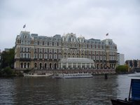
(Hotel Amsterdam from the Amstel canal)

Yesterday I did our class assignment of going on a "miswalk" of Amsterdam. A "miswalk" consists of creating a new way to walk and explore the city in an interesting or off-kilter manner. The goal of this assignment was essentially too get lost in Amsterdam and encounter unexpected things (you know, psychogeography and all that).

My miswalk of Amsterdam consisted of traveling across the city in a diagonal line of sorts. The pattern that I created alternated between walking one block north and one block west. While this pattern was pretty fun to follow, it was sometimes not very exacting; I was thrown off course several times by canals, dead ends, and the event of walking in squares (this occurred when the block on which I walked curved too far back in the direction from which I had just come).

I began my walk at Leidseplein Square because I figured that its bustling surroundings would provide more interesting things to see than those of the residential neighborhood in which we are staying. After witnessing the crowds, tourists, and neon signs of Leidesplein Square, I walked into a more typical, residential neighborhood. The most exciting things that I saw in this area were a Yellow Bike tour, and a piece of metal that flew off of another bike that rode past me. After this little residential lull, I approached Dam Square, as well as complete change of setting. The increase in the noise level alone was, to me, the most noticeable change as it signaled an entirely different environment, one filled with people shopping, milling around, and speaking in different languages. After I had become a bit frustrated by walking around in two successive squares, I entered a narrow shopping alley, and just as I thought I couldn’t handle seeing another loud tourist, I emerged from the alley, and was directly across from Centraal Station. This was a nice confirmation of my pattern, as I had originally assumed that I would come out somewhere near the Station.

From Centraal Station, I began to follow the same pattern of walking one block “up” and one block left, this time going south and east. The most interesting/disturbing part of my miswalk occurred during this second half in, where else, the Red Light District. I actually had no idea that I was heading directly towards it, but I knew where I was as soon as I reached it by the crowds of people of all ethnicities walking slowly and looking from one sex shop to the next. At first I felt a bit odd walking by myself in this area, but once I realized that there were other women walking around-granted, they were all in groups with other people-I felt comforted in some way by the female presence.

As the time for me to make a cube approached, I was still very much in the heart of the Red Light District. I remembered that some people in our program said that you couldn’t take pictures of prostitutes in the District, but I didn’t see any, at least as far as I could tell, so I figured it would be okay to take pictures. I was about to stop at an intersection and make my cube when I noticed a rather shady looking man standing there, watching me. Needless to say, I kept walking, but did not feel any more comfortable stopping in front of any of the various sex shops to take pictures. It was at this point that I noticed that some of the men I passed were looking at me in a fairly disquieting way; the fact that I was a young female walking alone in the Red Light District set in, and I no longer felt comfortable. As my discomfort with the situation increased, a man came up to me, grabbed my arm, and said something along the lines of, “Hello beautiful miss. Can I ask you something?” I immediately pulled my arm away, said “no,” and walked up the block as fast as I could. I didn’t stop until I was several blocks away, and only after I gathered myself did I make my cube. Thus, one side of cube number seven of my miswalk features the Red Light District, from a distance (it is the side with neon lights).

After this encounter, the rest of my miswalk will probably seem fairly uneventful, unless you count admiring the beauty of canals and bridges as excitement, which I certainly do! I don’t know how many canals I passed, crossed over, and looked at during my miswalk, but each one seemed unique and noteworthy in some way. I think one reason why the canals interest me so much is because each one creates a small division in the city, yet it also feels like the city is united by the presence of the canals, and thus also by these divisions. You can also feel the incredible, historical significance of the bridges and canals when you walk across or even see them, and I very much like the idea of being able to walk through and thus access history on a more personal level. The end of my walk occurred at such a point, or at least I felt that it was important because it was a fairly large intersection of two different canals, and presented an amazing view of four different directions one could take to explore Amsterdam.

Amsterdam, ik vind je erg aardig.

Friday, October 27, 2006

Ik zou graag naar de speelzaal.

(Advert for xolo.tv vlogging program)

XOLO!!! Today we were fortunate enough to have Marc von Woudenberg of Xolo.tv visit our IES classroom. I say fortunate enough because the “lecture” (Power Point yet again) was extremely informative, at least to a not very media literate person such as myself. For those of you that don’t know, Xolo.tv is a company that creates video blogs, or vlogs, for various businesses, including Coca Cola and BMW, amongst others.

Today was the first time that I got a clear understanding of what video blogging actually means, and also of the potential that it has. Vlogging allows anyone to make a video and post it to the internet, or to a specific streaming source. Videos that appear in vlogs, however, are different than videos that would appear on say youtube, for example, because they are presented in the form of one person or a small group of people in front of the camera, talking about different subjects. Similar to blogging, vlogging is also sort of like an online diary that other people can access. Some people (or vloggers) make vlogs simply for fun, while others are incredibly serious about theirs and make them for informative purposes. There are, of course, vloggers who mix the two extremes, and they seem to be the most successful. I think this is due to the fact that the information they present is made more accessible, and thus more enjoyable to watch, through humor.

Apparently vlogging can be quite a controversial issue as some people in our group got into a fairly heated debate with Marc over the present state and future possibilities of vlogging. John offered some criticism of the current state by mentioning how as soon as people got wind of this vlogging trend, they made vlogs about funny or ridiculous things, instead of about serious matters that could impact or at least inform the world. John eventually added that though he is completely for alternative forms of media, and also for humorous outlets, he wonders why vlogging can’t be done in a more mature manner. Rachel offered an excellent metaphor in response to this inquiry: she said that if we think of the internet, and specifically the new vlogging medium, as a child, this is its early, immature stage, and it will be a number of years before it reaches a more adult state.

A concern of mine with the whole vlogging (r)evolution is that the different sections of society who don’t have/can’t afford computers or other media consuls in their homes, or even in a more public place, will be excluded from the movement. And if all of our media sources shift more or less to the internet, will these sections of society be missing out, once again, on being informed citizens? Our class also discussed the issue of media literacy, and how children in the US public schools system aren’t receiving any sort of instruction in how to create, digest, and especially analyze the images with which they are presented, in both new and old media.

This bothered me greatly, as I see media literacy, as well as the ability to distinguish between what is real and what is exaggerated, as yet another way that the increasingly large gap between those who are privileged and those who are not will grow. Disturbing. I simply hope that my concerns will be proven wrong, and that the internet (r)evolution will continue to be a bottom-up process. However, seeing as corporations are beginning to jump on the vlogging bandwagon and make vlogs that appear to be grassroots in nature, I am a bit hesitant with this hope, especially if people already have difficulty in differentiating between what is real and what is exaggerated in the media.